Please feel free to click on each example to visit the actual website
in action.
Also, remember that some of these designs are now getting old and
the customer may have upgraded the design since we implimented it
- clicking on the thumbnail image will being up a full size image
of the site design for you to look more closely at.
We take the time to work with each client to get the look they are
looking for, frequently turning to our graphics design team for expert
advice and quality just for the general 'look and feel' of a site.
Sometimes, the customer knows exactly what they want, and we work
with them to see the project through their eyes.
Other times, the customer will surf around the internet, and find
a few sites they really like the look of, or see just a single characteristic
they want in their own site, and we take a look at those sites, and
create the website of their dreams.
You know, its worth noting that we have yet to have a customer who
was not 100% satisfied with their finished web site.
Anyway, enough of that, take a look around, and see if anything catches
your eye.
My approach to online applications involves a screenshot "base map" over- layed with eLearning features and functionality. This allows the learner to stay in the same frame mind whether using or learning about the application.
Here is a modest prototype based on a chat service for synchronous eLearning.

Here is a true Knowledge Management application of my mapping and navigation technologies. Imagine trying to "map" all the great ideas ever written by man (ever). I've mapped one of the Great Ideas through to original source documents on the web...
Navigate the Great Map from Happingess to Wisdom to Kant to Fundamental Principles

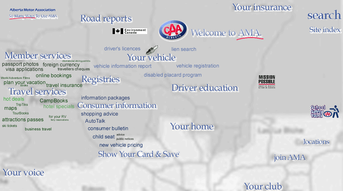
Since maps are highway maps are an integral part of any AAA operation, why not have a web "site map" to help people navigate to the information of interest to them?
This
true "sitemap"
done for part of the Autodesk site demonstrates the effectiveness of this
visual navigational approach;
Wouldn't
it make alot of sense to "map"
out the benefits of the approach that I take to net navigation and knowledge
management?...
This is a process map for an eBusiness application;
Using a beta version of images.google search engine, I found the best use of visual sitemapping on the internet. Here are 25 of the best concepts in use today;

I am trying to use mapping technology to provide another way to view these graphical sitemaps.
- Here is one of my main current initiatives. I'm developing content specifically dedicated to internet navigation, for a single site (see sitemaps), or across the whole net. I apply the philosophy that the content itself provides the best navigation . If you know anything about mind-mapping, you'll be able to see what I'm doing.
I developed http://www.1-900-870-6235.com/navigation.htm
- In addition to assimilating new knowledge, we can develop practical
skills (like how to use a new software program); Here is the best way
to learn Dreamweave online;
http://www1-900-870-6235.com/Images/DWfirstscreen.htm shows how tool boxes on a computer screen can be treated like islands with links to valuable eLearning content. Again explore the menues this program uses by mousing-over, clicking, etc..
http://www.1-900-870-6235.com/Navigation/quoticasitemap.htm
Every on-line software application can be fitted with several "skins" that appeal to different users. Here is one that fronts an online request for quotation system. Note that all the content and functionality is maintained by the original software developer.

This is where we feature the interactive map I develop for your website. ; )
email me your URL
Notice the icons and opaque images used to convey information in the map background;
To map out a "universe of eLearning opportunities", I used a solar system metaphor;
- If you are confused do you like to group together the "islands of
Information"? These "topical" islands are one of the best
ways to organize information. When presented in a visual manner we can
see helpful associations and relationships (forget about useless alphabetical
indexes and directories!).
http://www.4realhelp.com/RealHelp/menu_items/Develop/Training/index.htm is an example of the islands of information approach to information mapping. See how I used it to categorize eLearning products and vendors.
- eLearning
I continue to be focused on the use of the internet for learning and training purposes.
- If you get lost in the "Silicon Valley" of computer problems, isn't
it nice to have a helpful map that shows possible paths to your solution
destination? It's easy to get lost in these complex net technologies,
so its nice to know that helpful maps are available. I'm one of the
people developing them;
I drew the map at http://www.4realhelp.com/RealHelp/index.htm over the US westcoast (i.e.; Silicon Valley). It maps out a handful of directions you can go to get computer help when you are lost (but watch out for those 3 mischievous "smiley" buttons). This is the first learning map I built. I'm much better at it now ; )
- Its
even possible to "web-enable" those brilliant "dot.com" ideas that you
sketched out on the back of an envelop; Look what we can do with a handwritten
"mindmap".;
http://www.4RealHelp.com/RealHelp/mainsj.htm (let your mouse run down some of the branches). Then we can push back, look out the window and wonder what "the street" would think about these navigational discovery learning approaches.
- When financial guys talk about "the street", what do they see when
they look out the window?...and
who really cares : ) More importantly what kind of valuable information
can we add to that typical view?....
I developed http://www.1-900-870-6235.com/eLearning/computerstockmap.htm to introduce the concept of image mapping over familiar realworld views and images. It's much like adding logo signs to the tops of downtown buildings, except my graphics provide a window into treasure troves of valuable information available across the net.
- Sometimes a visual approach will help you "get the picture" (and save alot of reading time). Even these company names and logos (and their corresponding websites) can describe my philosophy better than pages of words ever could...
http://www.4realhelp.com/RealHelp/menu_items/Site_Info/Future_Plans/Philosophy/index.htm
- We can link web explorers to other forms of learning support like
newsgroups, chat, phone support etc.
(with real people in San Francisco, Boston, or Edmonton, or ?)... http://www.4realhelp.com/RealHelp/menu_items/Information/Expert/index.htm
- When I say that I have mapped out a business plan... I mean it.. http://www.1-900-870-6235.com/Investing/mission2000.htm


